
Step by Step Tutorial: Using the Interactive Education Statistics AddIn
Learn to speak "statistics". Below are the 14 steps that you must take to use the Interactive Statistics Education AddIn. Actually, all you need to do is Steps 1-4 and the rest just happens. You can just read the interactive messages that pop-up on screen and see your report being created in front of you. You can view a sample report without the interactive, on-screen pop-up messages.
Here is your step-by-step tutorial to follow after you buy and download the Interactive Statistics Education AddIn.
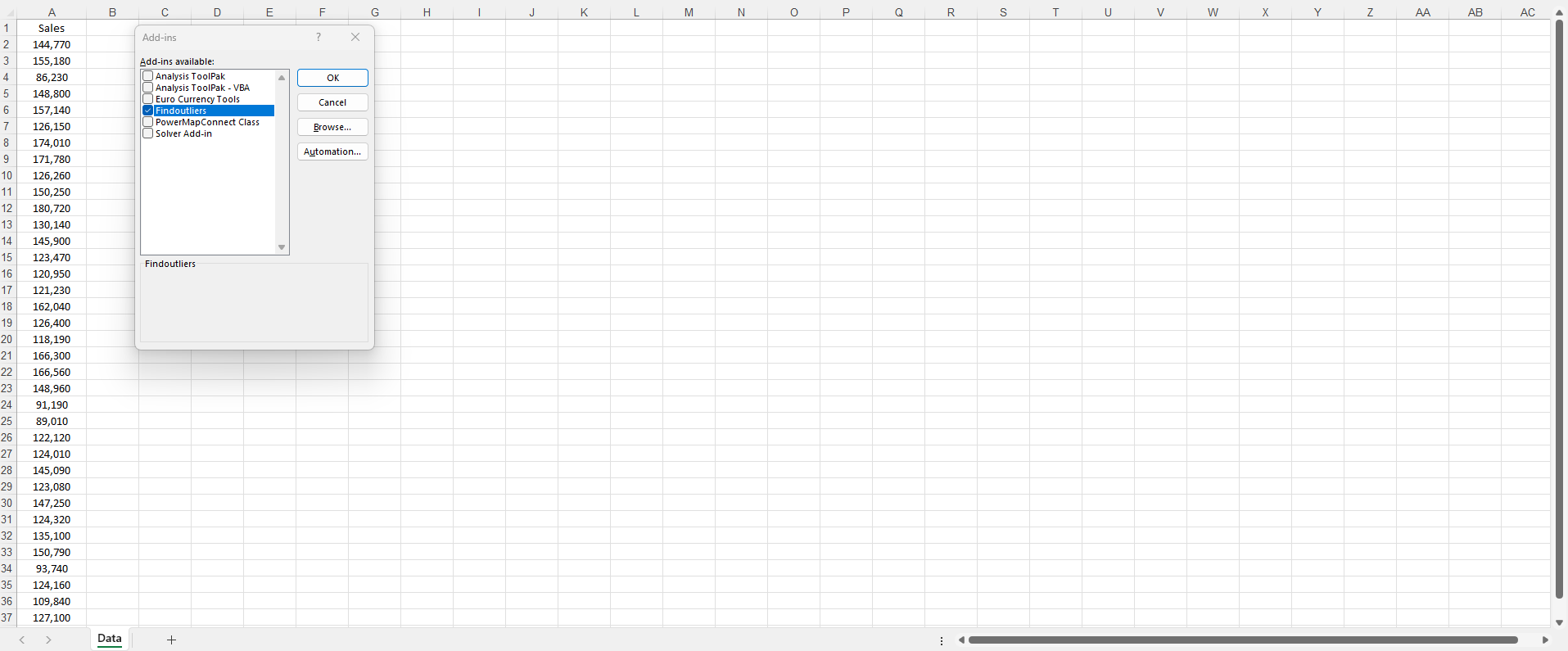
Step 1: Add the AddIn in Excel
Whether you use the Interactive Statistics Education AddIn or not, flagging and visualizing outliers in your data can help you learn a lot about how to successfully apply statistics as a data science or analytics professional with or without the use of algorithms.
Step 2: Select the 'Outlier Analysis' Tab
If you do choose to buy, download and install the Interactive Statistics Education AddIn, you will see a 'Find Outliers' button on an 'Outlier Analysis' tab at the top of every Microsoft Excel workbook that you open.
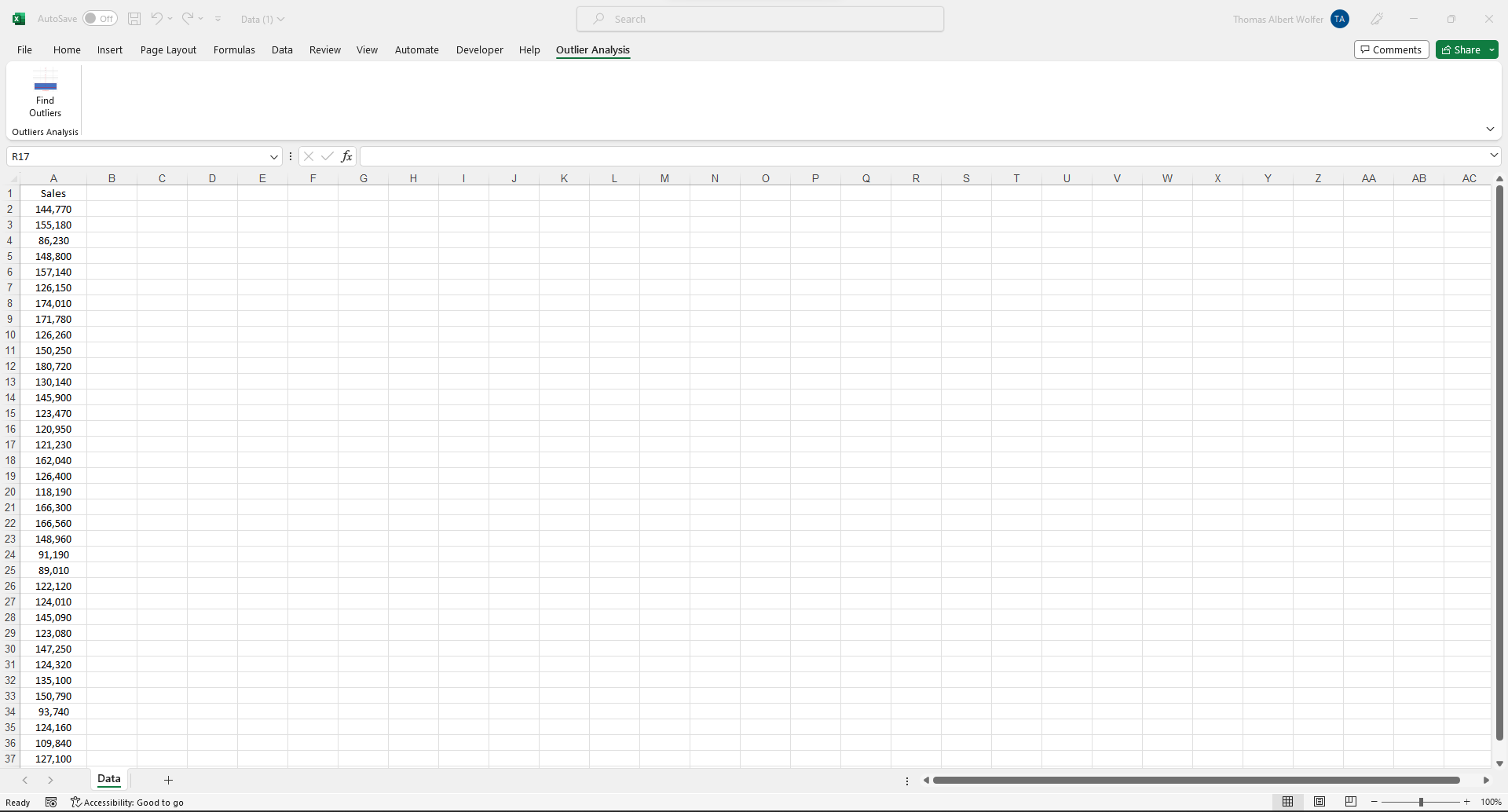
Step 3: Click the 'Find Outliers' Button
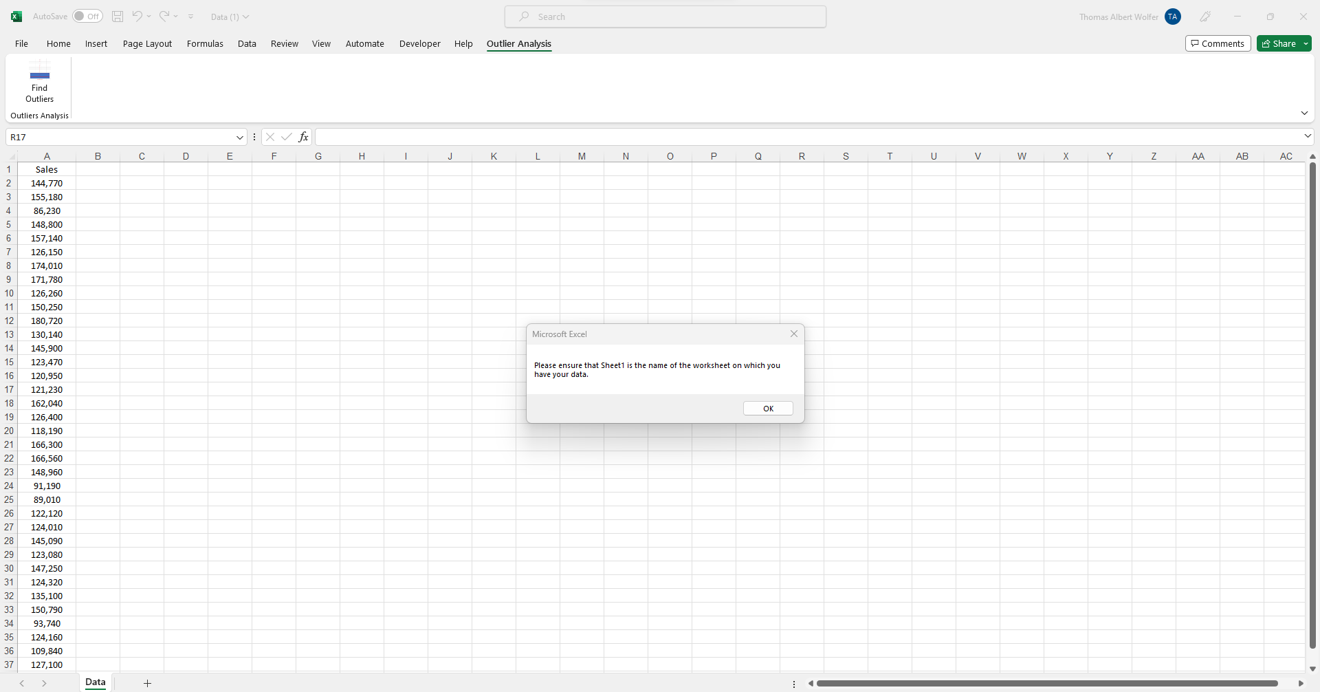
To use the Interactive Statistics Education AddIn, all you must do is have your column of numeric data (eg. #, $, %) in Column 'A' on a worksheet labeled 'Sheet1' in your Excel workbook so that your report will be generated automatically.
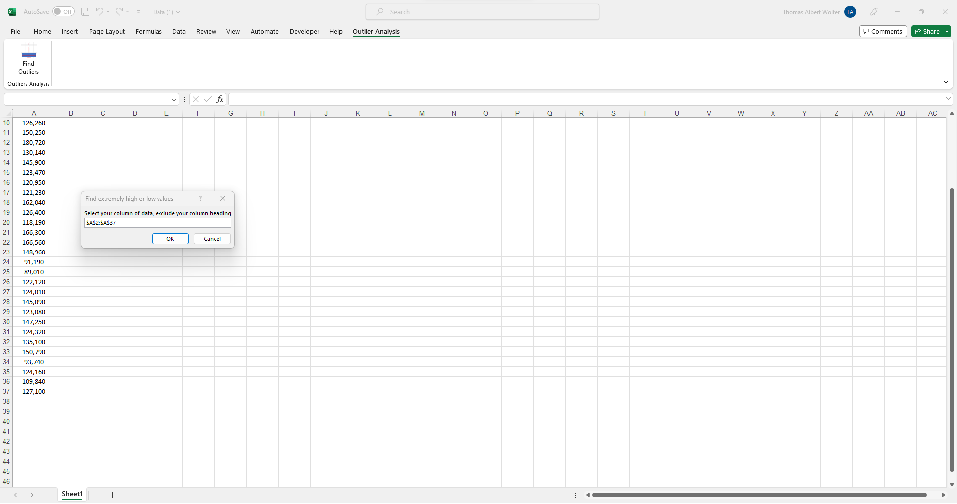
Step 4: Select Your Column of Data
Once you click the 'Find Outliers' button of the Interactive Statistics Education AddIn, you will be prompted to select your one column of data in Column 'A' to be analyzed for outliers, and this column will be used to generate interactive on-screen messages and a full outlier analysis report automatically in the next steps.
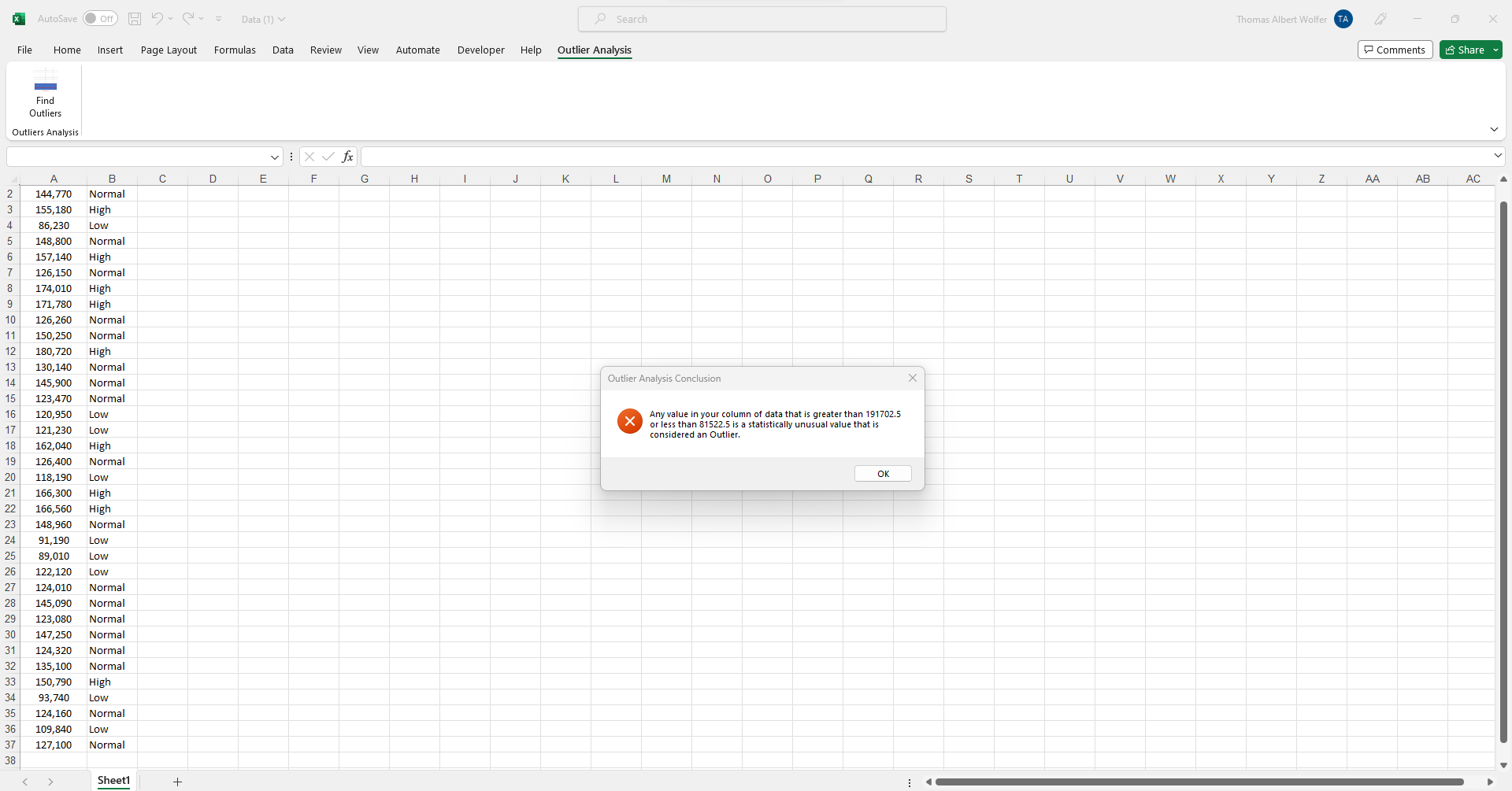
Step 5: Outlier Analysis Conclusion
A new column of data has been added in the first stage of the outliers report creation: it flags which data points in Column 'A' are 'High Outlier' or 'Low Outlier' values based on the statistical theory of the box & whisker plot. You can also see a summary conclusion pop-up message on-screen explaining which dataset values are outliers. Click the 'OK' button to move on to the next step automatically. Try the Free Outlier and Anomaly Detection Template to see how flagging outliers works.
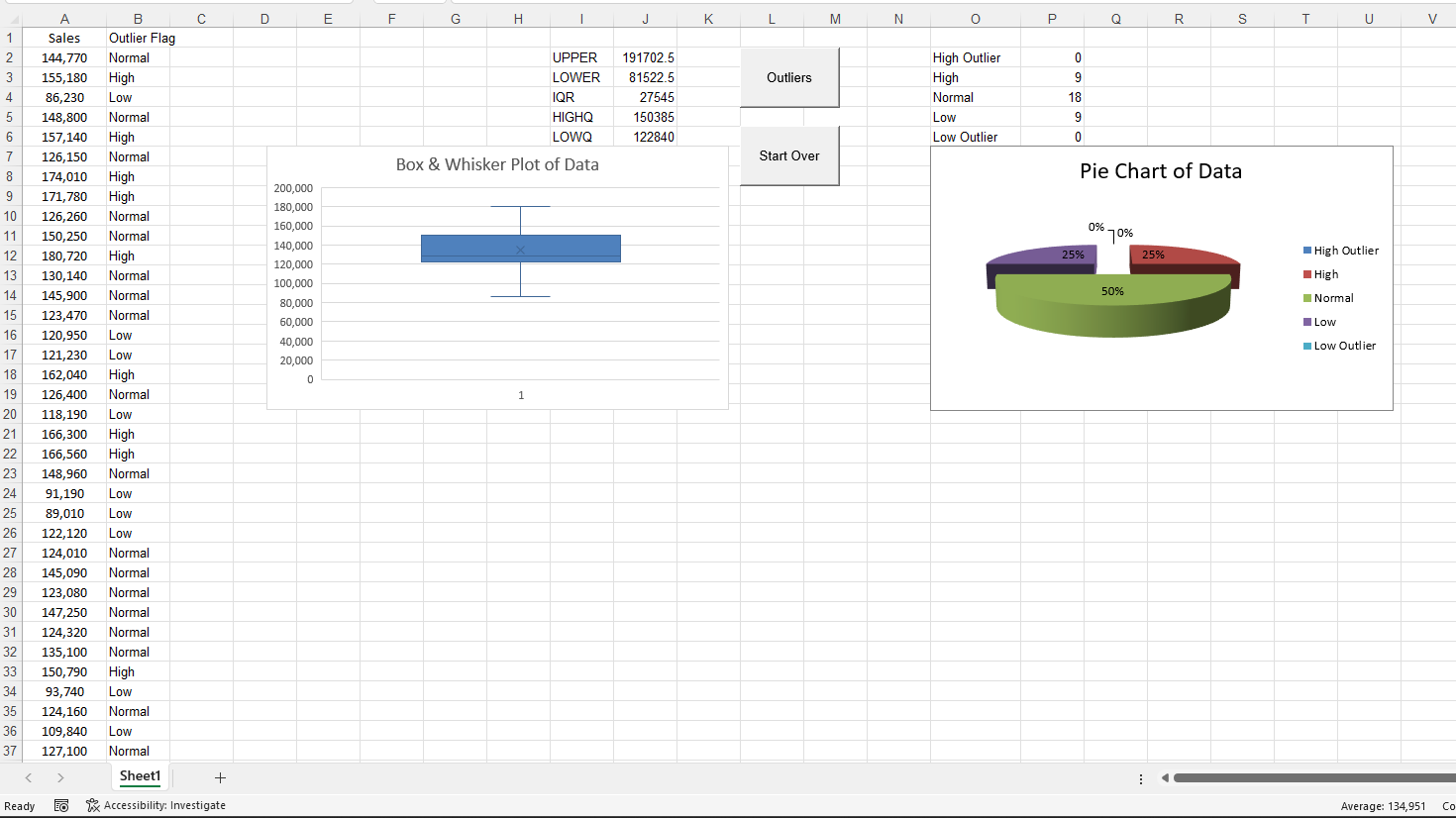
Step 6: Descriptives Report and Charts
Now, you can begin to see a box & whisker plot created to visually display data points which are 'High Outlier' or 'Low Outlier' in your dataset. And, a pie chart summarizes the percentage of your dataset's records that are considered 'High Outlier' and 'Low Outlier'. If you do not see any dots above or below the 'whiskers' of a box plot - the horizontal lines at the top and bottom of it - there are no 'High Outlier' or 'Low Outlier' values in the data. You can try a Free Box & Whisker Plot Graph Template to see how the box plot works.
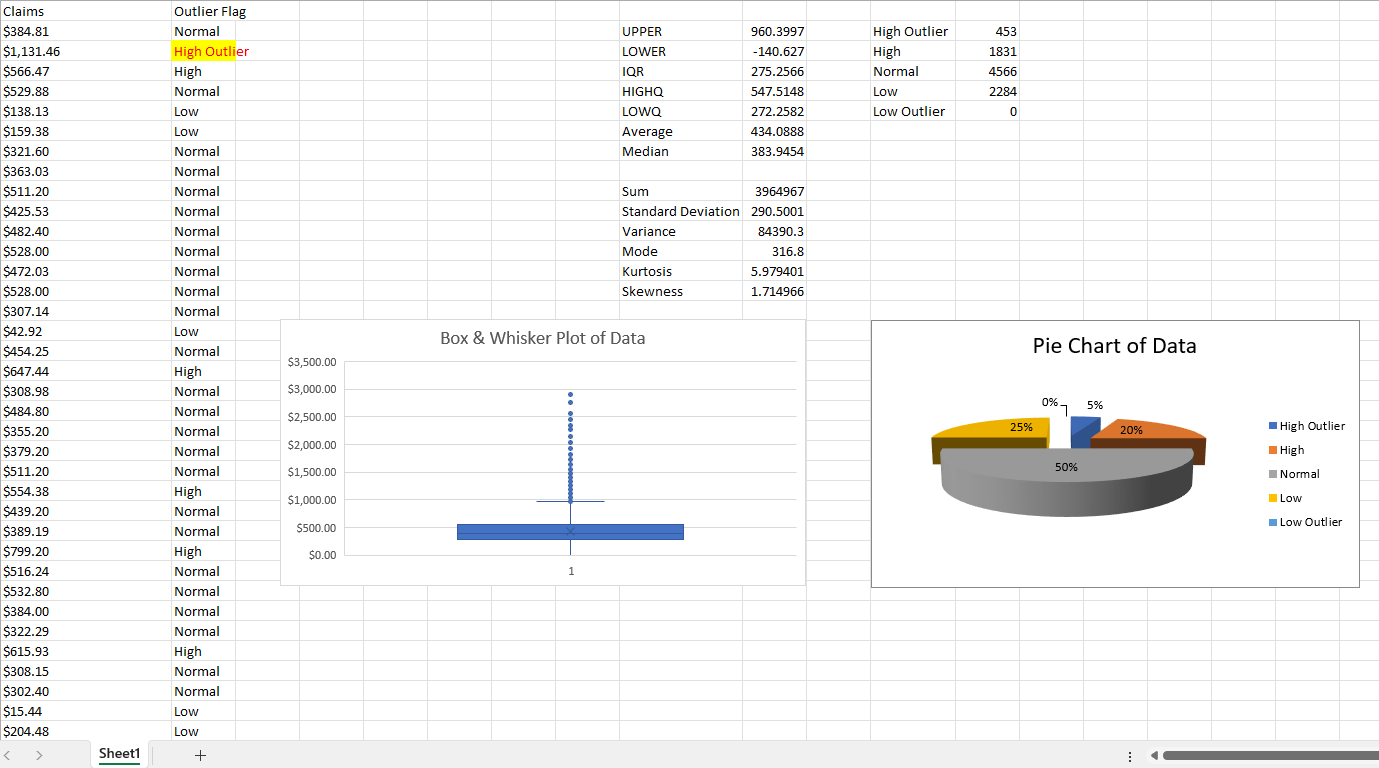
Step 7: Descriptives Report and Charts
As the box & whisker plot and pie chart are being completed, a detailed descriptive statistics summary report is generated from Column 'A' of data, and you will begin to see this report in the next step. The UPPER and LOWER data values seen below reflect the values for the box plot 'whiskers': data points above and below these values indicate 'High Outlier' and 'Low Outlier' values, respectively, in the dataset.

Step 8: Descriptives Report and Charts
At this stage, you can analyze the simple descriptive statistics for a dataset to understand whether data has 'High Outlier' or 'Low Outlier' values causing your 'Average', 'Median' and 'Mode' descriptive statistics to be different. The extent to which this is true will be reflected in the 'Kurtosis' and 'Skewness' statistics and, as you will see later, your histogram and scatter diagram. The greater the difference between the 'Average', Median' and 'Mode', the larger the 'Kurtosis' and 'Skewness' values will be: and these two metrics can be negative, positive, or have a value of '0'. Data for which the 'Kurtosis' and 'Skewness' are both '0' indicates that the 'Average', 'Median', and 'Mode' are exactly the same value. The bigger (negative or positive) that the 'Skewness' and 'Kurtosis' values are, the larger the gap between the 'Average', 'Median', and 'Mode' descriptive statistics.
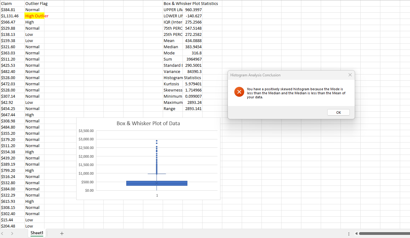
Step 9: Descriptives Report and Charts
At this point, the full descriptive statistics report is generated. A histogram has also been plotted to help interpret the dataset's distribution based on the 'Skewness' and 'Kurtosis' descriptive statistics in the analysis. If the 'Skewness' and 'Kurtsosis' values for dataset are both '0', you will see a perfectly symmetrical histogram with an equal distribution of records above and below the 'Median' - or, '50th Percentile'.

Step 10: Histogram Analysis Conclusion
The Histogram Analysis Conclusion on-screen pop-up message displays a customized message explaining the interpretation of the 'Skewness' and 'Kurtosis' descriptive statistics. And how they impact the histogram you see - a reflection of the 'Average', 'Median', and 'Mode' descriptive statistics. Click the 'OK' button to move to the next step automatically.
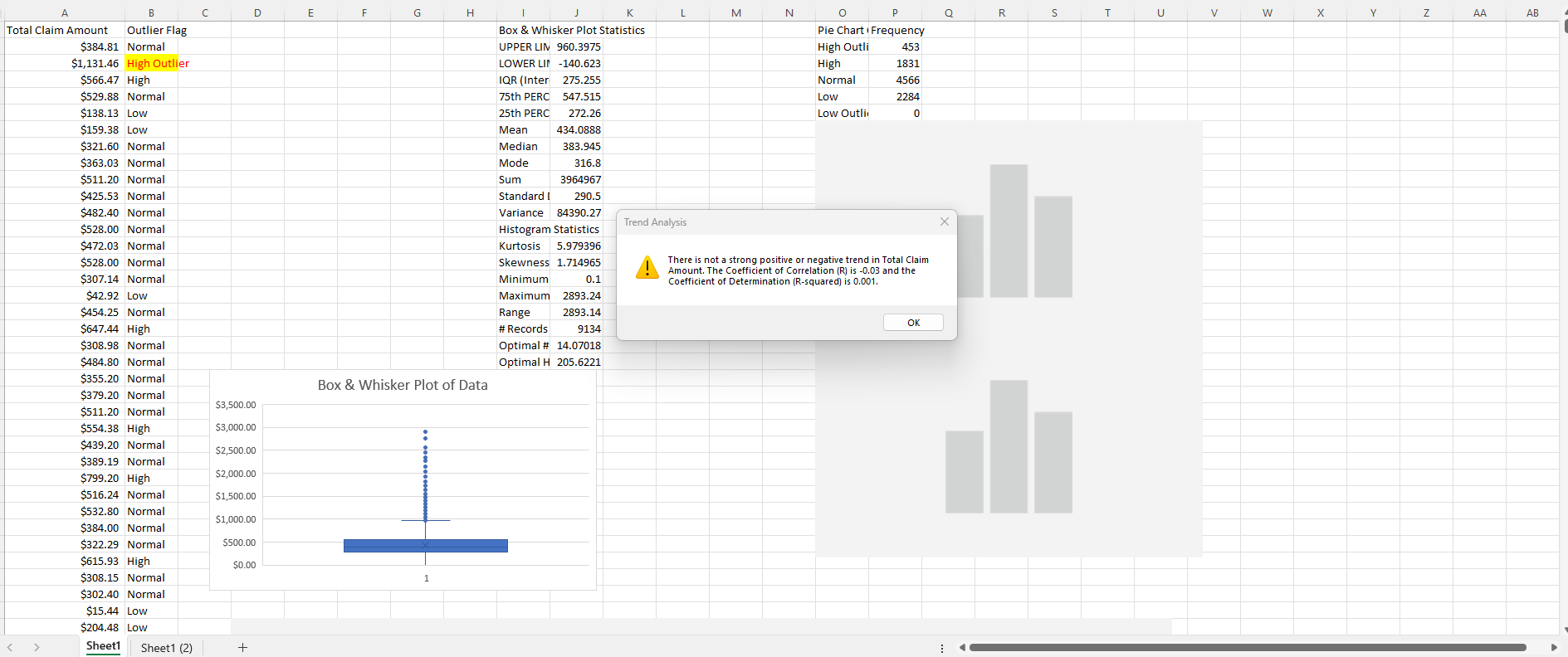
Step 11: Trend Analysis Conclusion
At this point, the Trend Analysis Conclusion on-screen pop-up message provides an analysis of whether the trend in a dataset is positive, negative or neutral. And, it displays 'R' and 'R-squared' co-efficients to support the conclusions. 'High Outlier' and 'Low Outlier' values in data will have an impact on whether an accurate trend can be viewed and predicted, and this is reflected in lower than desirable 'R' and 'R-squared' co-effiecients. The value of 'R' ranges from -1 to 1, and the value of 'R-squared' ranges from 0 to 1. And 'R' of '-1' indicates that there is a powerful downward trend in the data: as time goes on, new values in the data will become lower and lower. An R-squared value of '1' indicates that you can use the current data to perfectly predict an upward trend in future data values over time. Under the 'Histogram Statistics' in Column 'J', you will see the 'Optimal # of Bins' and 'Optimal Histogram Bin Width' values. These metrics will help you analyze and change the distribution of your data with a histogram before using it to forecast or in a business analytics report. The 'Optimal # of Bins' describes how many categories that your data should be organized into on a histogram. 'Optimal Histogram Bin Width' indicates how wide each bin should be (in whatever unit of measurement that your data is in) to help you create the lower and upper limits for each category on your histogram. Click the 'OK' button to move on to the next step automatically.
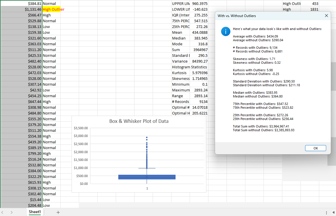
Step 12: With vs. Without Outliers Analysis Conclusion
Now you can understand what a dataset - as measured by descriptive statistics - looks like with and without the 'High Outlier' and 'Low Outlier' data values flagged in previous steps. The summary 'With vs. Without Outliers' report can help understand to what extent data outliers cause a problem when forecasting or reporting Key Performance Indicators (KPIs). Click the 'OK' button to move on to the next step automatically.
Step 13: With vs. Without Outliers Box & Whisker Plot
As the scatter diagram and a new segmented box & whisker plot are generated, the impact of 'High Outlier' and 'Low Outlier' values in the dataset become visually clear. Two new columns of data show up in Columns 'W' and 'X' of 'Sheet1': one column is the entire dataset - 'With Outliers', the other one data points excluding outliers - 'Without Outliers'. Try a Free Scatter Diagram Template to see how the scatterplot works.

Step 14: Student's t-Test Analysis Conclusion
In this final stage, we see an on-screen pop-up message summarizing and explaining a t-Test analysis confirming that the values in Column 'W' - 'With Outliers' and Column 'X' - 'Without Outliers' represent two statistically significant different sets of behaviour. If the t-Test Statistic is less than or equal to the p-Value (.05) level of significance, then the two columns ('W' and 'X') of data represent distinct patterns of behaviour. Click the 'OK' button to end the report.
